
Your website should act like your best salesperson: clear, confident and convincing. Many websites are weighed down by elements that confuse visitors, disrupt user flow or actively push people away.
By identifying and removing potential culprits, you can improve the user experience and strengthen your Search Engine Optimisation (SEO) - the process of making your site more visible in search engine results. The better your SEO, the easier it is for potential customers to find you online.
If your site isn’t converting as well as it could, these 13 common website killers might be the reason.
Website Killer #1: Vague Homepage Headlines
Your homepage headline is one of the most valuable pieces of real estate on your site. It’s the first thing visitors see, and it needs to immediately answer the question: "Am I in the right place?"
Generic greetings like "Welcome to [Brand Name]" don’t offer much value. Instead, clearly state what you offer and how it benefits the visitor. Think beyond clever phrases and focus on clarity.
A strong, descriptive headline not only reassures users they’ve landed in the right place, it also helps search engines understand your content, which supports your SEO.

Website Killer #2: Generic Navigation Labels
Your site’s menu is not the place for mystery. Avoid vague labels like "What We Do" or "Discover". Instead, use keyword-relevant, intuitive labels that reflect how people search like "Services" or "Why Choose [Brand Name]".
These not only help users but also support your site's SEO by reinforcing content themes and improving internal linking.
Website Killer #3: Meaningless Subheadings
Subheadings break up long sections of content, help readers scan your page quickly and highlight what each section is about. Most users don’t read every word; they skim. So if your subheadings are vague, overly clever or off-topic, they’re not doing their job.
Clear subheadings also improve accessibility and SEO by allowing screen readers and search engines to scan your page effectively.
Use subheadings that mirror search intent and incorporate language your audience would use.
Instead of a vague subheading like "Our Approach", try something more specific like "How We Design [Your Product]". It tells the reader exactly what to expect and helps with search engine optimisation (SEO) by incorporating natural, relevant keywords.
Website Killer #4: Coloured Social Media Icons (Above the Fold)
While linking to your social media is important, having big, brightly coloured icons at the top of your website is counterproductive. You’re essentially inviting visitors to leave your site before they’ve even explored it.
Instead: Add social links in the footer, where they’re accessible but not distracting.
Website Killer #5: Ineffective Homepage Sliders
The real issue isn’t the slider itself but when each slide carries a completely different message. This splits your brand focus and can overwhelm or confuse users, especially on mobile where people are less likely to interact with multiple slides.
On the French Festival website, for example, users are directed to the website to find out more about the Intrepid competition. However, their homepage slider contains the only source of information on the home page - and it is buried on the third slide - meaning many visitors could easily miss this information as they won’t wait long enough for it to appear.
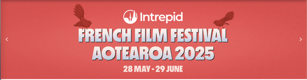

Instead: If you want to use a slider on your homepage, make sure it has a single, compelling headline that stays consistent across all images. Use it to reinforce your main value or theme, not to deliver multiple competing messages. Always place the most important information on the first slide and be mindful of the order so visitors don’t miss key details.
Website Killer #6: Stock Photos
Audiences are savvy; they can spot a stock photo a mile away. Generic images of smiling office workers or perfectly diverse boardrooms don’t build trust.
Instead: Use real photos of your team, customers or actual work. If privacy is an issue, go for high-quality, abstract brand imagery or product shots instead.
Authentic imagery performs better and keeps visitors engaged longer - two things Google loves.
Website Killer #7: Dates on Evergreen Blog Posts
Unless your blog post is tied to time-sensitive news or events, including a visible date can unnecessarily "age" your content. Readers may see a date from 2022 and assume the advice is no longer relevant, even if it is.
Instead: Only show dates when they add value (e.g., legal changes, trends, updates). For evergreen content, either hide the date or update the post periodically and mention the latest update date.
Website Killer #8: Long Paragraphs
Online readers skim. If your paragraphs stretch longer than 3 lines on desktop, they’ll look even worse on mobile. Big text blocks discourage reading.
Instead:
- Add subheadings to highlight sections
- Break up your text into shorter chunks
- Use bullet points, quotes or bold text
- Add images or icons to guide the eye
Note: Even if the content is good, most readers won’t make it past the first few lines.
Website Killer #9: Posting Press Releases
Press releases are typically written for journalists and often use dense, formal language. While they can be useful in a media kit, they’re not ideal for engaging web visitors.
Instead: Reframe press releases as blog posts, customer stories or brand updates. Speak directly to your audience, not just the media.
Website Killer #10: PDFs
Uploading information as a PDF may seem convenient but it’s not great for usability or SEO.
Problems with PDFs:
- Hard to navigate on mobile
- Don’t track well in website analytics
- May not be indexed properly by search engines (unless optimised)
- Can’t be easily shared or linked within a user journey
Instead: Repurpose the content directly onto your website. If you must include a PDF, offer it as an optional download rather than the main content format.
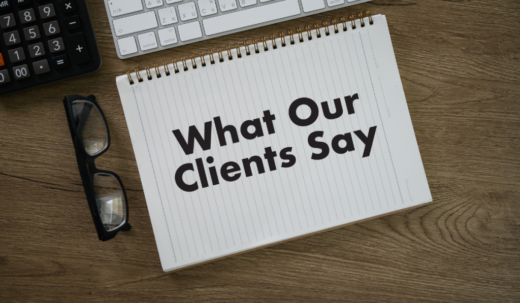
Website Killer #11: Testimonial Pages (Without Proof)
A standalone testimonials page filled with vague praise like "Amazing service!" and no names or context doesn’t inspire confidence.
Instead:
- Include names, roles or company names (with permission)
- Add reviews from verified platforms like Google Business Profile or Trustpilot
- Include stats, ratings or awards to reinforce credibility
Website Killer #12: Email Links
Publishing a raw email link (e.g., info@company.com) opens you up to spam bots. These automated crawlers harvest email addresses and flood inboxes with junk.
Instead: Use a contact form with proper spam or bot filters. This protects your inbox and helps guide users into your funnel more efficiently.
Website Killer #13: Dead-End Thank You Pages
A "Thank You" page should never be the end of the road. It’s a valuable opportunity to keep users engaged and deepen their experience.
Instead of simply having "Thanks for signing up!" or "Thank you for contacting us." Try to:
- Recommend next steps (e.g., "Read our latest article" or "Check out the Frequently Asked Questions") and add a link or button to these pages
- Include an exclusive offer or discount
This turns a dead end into a springboard for further engagement.
Every element on your website should have a purpose. If it’s not helping guide, inform or convert your visitors, it’s time to let it go. By removing these 13 website killers, you can dramatically improve your user experience and help improve your online visibility.
It’s not just about what you add to your website - it’s also about what you remove.