Few tactics are as effective at conveying a brand personality and encouraging engagement on social media as a carefully selected image. In this fast-paced-scroll world of social media, the visual images are the first thing your audience sees and it might be the one thing they remember.
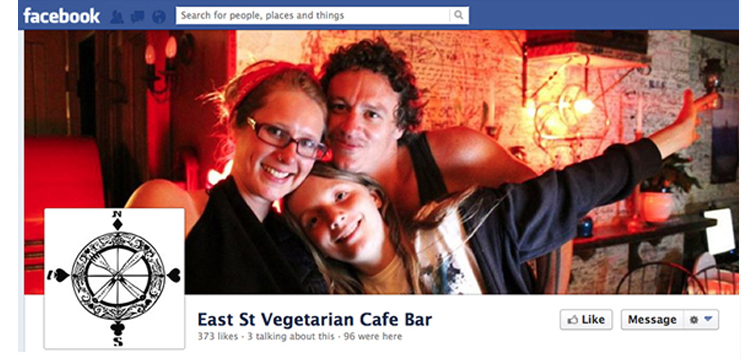
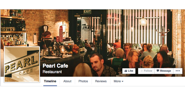
In the two Facebook cover images shown below, which cafe would you frequent? I imagine within less than a second you will have made your mind up about which you prefer based on the image the cafes have chosen to represent themselves.

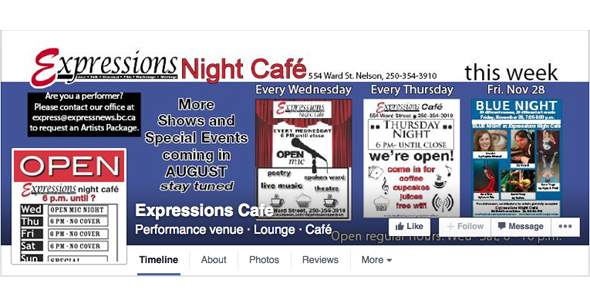
This example below shows how the owners have so much to say they have simply put EVERYTHING onto their cover image which has effectively made it impossible to take anything in. Keep your message simple and use the description tool to add extra copy in.

To optimise your social presence, you must ensure that the images you’re using to represent your brand are high quality and the best fit for the various networks. To help, we’ve outlined the best image sizes for Facebook (desktop and mobile) and image type.
Your Facebook Page’s profile picture:
Displays at 160 x 160 pixels on computers, 140 x 140 pixels on smartphones and 50 x 50 pixels on most feature phones.
However, the image must be at least 180 x 180 pixels. Your image will be cropped to fit a square.
Ideally we recommend using your logo here or part of your logo that is easily identifiable. Businesses often make the mistake of inserting an image that works on a desktop on the actual Facebook page but in the fan’s newsfeed it becomes unidentifiable.
Your Facebook Page’s cover photo:
– Displays at 851 pixels wide by 315 pixels high on computers
– 640 pixels wide by 360 pixels high on smartphones.
– Doesn’t display on feature phones.
Ideally you want to achieve a fast load so supply the file as an sRGB JPG file that’s 851 pixels wide, 315 pixels tall and less than 100 kilobytes.
For profile pictures and cover photos that display your logo or text, you may get a better result by using a PNG file.
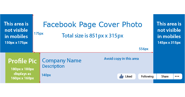
See our handy reference visual below which indicates the areas that aren’t visible in mobile views. Remember to keep all critical information out of these areas.


